Showing posts with label colour. Show all posts

Thursday, June 25, 2009

Black you say?

black


Yes, indeed, Silk black in fact, Pro-Chem’s #610.

IMG_0205

My favourite for silk cloth. Drop a little in a wet sink and look at all those colours! Add a bit more water and the colours merge into a rich black and all its various shades of gray, and best of all, they don’t split – no halos, no spotting, and no tell-tale under tones. Just black. This is specially important when I am over-dyeing a resisted item like the one below and I want a no nonsense black background.

IMG_0207


Thursday, May 14, 2009

Silk Garden Cloth

All this cloth I have collected this year... these were made to test colour relationships, resists etc. They sit, piling up and they languish on top of my dryer.

I feel the need to put them to use, perhaps cut them up and have them work together somehow. This green one below involved several processes to achieve the texture and layers of colour. Maybe I won't cut it up so much.


This is a multi-colour silk screen process. I have tons of this stuff, so I will cut away with little fear.


Here is more of the green. I really love this piece. It reminds me of a Canadian garden at this time of the year - full of promise.


Ah, my dot cloth. This swatch makes me want to go back to the silk screen and dye pots to make more of this in different colour combos.


See you all later...

Wednesday, February 25, 2009

Swatch Art

Lately I have been involved in producing a gazillion silk and cotton swatches using all manner of dyestuffs. That and fabric paint, as well as discharge agents etc. I thought I knew a LOT about this stuff - not the case.

Just take this intense blue above. When it is over dyed with complements like strong orange (left swatch) or burnt orange (middle swatch) I see with 'the whites of my eyes' that the blue indeed does NOT discharge when stamped with discharge paste.
But then, I always knew that... what I didn't know was how gorgeous the blue is when peering out from beneath these complementary mixes.


Another swatch with an elastic resist. This one shows what happens when burnt orange is over dyed with mixing blue. The diagonal lines are discharged - this blue discharges.

Another elastic resist swatch showing what happens when intense blue is over dyed with grape then discharged. The discharge takes where there is only grape.

Here is what happens when sun yellow is overdyed with grape. Love the brown.

More swatches...these are silk habotai.

Wednesday, September 17, 2008

New work

Here is a peek at the stuff that currently moves from my wall to my table and back to my wall again. The top piece is finally quilted. It was designed with every shade of red that I could find in my stash. I must be anticipating a long, cold and colourless winter...


I have concluded that I don't have enough shades of red and I need to make more - a good project at this time.

This second piece was made with some hemp that I wanted hand dye.

It dyes OK, but doesn't hold a candle to pima cotton or silk broadcloth.


I joined it with a piece of burnt orange pima that I silk screened with a couple of motifs. It is now ready for quilting. I feel that this one will need about as much thread as the red one above.


Speaking of thread, I also have some hand stitching in the works.


I find that this is a great way to create a shibori resist for dyed fabric.
Here is an example of machine stitched resist underway,


And here is the result.


Not too bad. Next time I plan on using use a heavier thread to produce a bolder outline.

Tuesday, March 11, 2008

What's on my floor

Many many colour wheels. These are colour intensity studies done with opaque fabric paint on black cotton cloth. They are drying under the supervision of my trusty lab assistant.

Lulubelle waits patiently for more wheels to arrive as I am also making a 2nd set with transparent fabric paint. She thinks that I am having an attack of OC. Far from the truth!

Here are the two sets moved off the floor. I have fused the sheets together in a fan-fold arrangement so they can all be viewed at the same time and shades can be compared.
Now that these are done, I am about to make another set - this time, colour value studies. This is positively addictive.

Friday, December 07, 2007

Black and White study

There are times when I find that it is hard to get into the groove - or I should say back into the groove. This usually happens to me after a trip or the arrival of visitors (though I love the company and... the break), or even a bunch of TIA related meetings and administration. These all seem to sap any remnants of creative focus.

Luckily this time I came across a real old fashioned quilting challenge I bought into a couple of months ago. Normally I would lay this aside for a ''get-round'' to it day (smile). But this time it was just what the doctor ordered. The requirement is to design something using eight pre-ordained black and white fabric, plus one optional colour. This was brutal, as the eight fabrics swatches consisted of large graphic prints that needed taming somehow to work together.


I had forgotten how valuable a black and white exercise can be. This piece is roughly 26'' x 32'' and was made in two days. I am really pleased with it and I am now ready to work with colour.
Black & white Summer 2007 - 26'' x 32''
Here is a detail. I had to use a lot more white and black fabric to tame the bits - but it worked
This was a great exercise. I am now ready to plunge back into colour. Back in the groove!

Saturday, August 11, 2007

River song

I posted about this piece earlier, and I am still at it...eEight rows done, and it looks like four more are to come. It's getting bigger all the time. I guess the River has lots to say:-)
Here it is today -


Every once in a while I find that it is good to step away and look at the whole ensemble of individual modules. I still need to work out the the horizontal ribs separating these rows....

Thursday, July 19, 2007

White Water Thursday


Day four. Here is today's piece. I forgot to snap the original photo - darn. It makes it so much easier for you to relate to this process when you can see the original, sorry about that. The photo I was working from was shot in the rocky mountains looking down stream into a creek of white water. The whole picture was very dark with light hitting very little other than white water slapping against a few rocks. Ok, here is the original photo (retrofit post:-)


Again, another red rock treatment I'm afraid, but the real challenge today was how to convey running water over rock, oh and differentiate it from the snow sitting on the rock... another type of water. On my monitor this peg looks a very blue. The original has a lot more green, so when you see blue, think green. I spent all day on this one fat quarter of student grade primed canvas. The results are OK but I think that I could use another go at this motif.

Even though my results have been uneven, I have learned a lot of stuff this week that I have long wondered about. For instance, by using photography as a departure point (a black & white photo is ideal) I can take what I want from an original image and morph it into another design and colour combo representing what I feel like saying, conveying illustrating. The original image is that powerful when used this way. I have always known this , but for the first time I have actually done it "on command"and it works. On the technical side, I have also learned how to make shadows on snow that look real, made rock that looks real even if it is red, and water to look as if it is white or mirror clear.

Tomorrow is the last day of this class. For something completely different, Ted will demonstrate how to paint a nose, eyes, and lips. What fun. Who needs a face when you can get the nose right?!
Will post results tomorrow.

Wednesday, June 27, 2007

River swatches

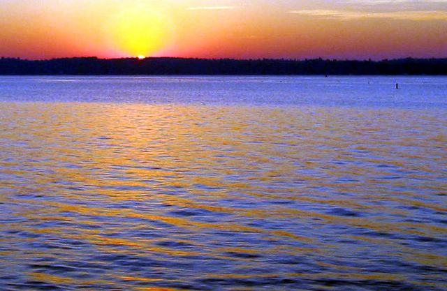
Last year I got up early one morning and snapped this shot of the sun rising over the St Lawrence river, then forgot about it.
Later on while playing around in Photoshop, I came across the picture and decided to use it. At the time I was trying to learn how to use the paint brush feature in this difficult and often frustrating colour software program.

I just came across the results of that work and realised what a powerful tool Photoshop can be for a colour hound. Those horizontal swatches you see are simply the result of selecting specific colour pixels in the original image combined with the brush feature. This extraction provides a fantastic colour palette for a composition.
On the down side... I have forgotten how I did this, and my Photoshop book is three inches thick! Ugh!

Wednesday, June 13, 2007

Rubber "opera gloves" for the dye lab - finally!

Look at these -- I finally found 23" long latex rubber gloves - long enough to reach the drain at the bottom of a laundry tub that is full of cold brackish dye water... they are called Elbow-length Mucking Gloves (they go past your elbow) and can be bought on-line from Lee Valley Tools for $7.95 Cdn.
Item no. BL650. BTW they will send you a wonderful gardening catalogue at the same time - free.


I finished up the 12 metres of tray dyed fabric. Honestly most of them needed a couple of tray treatments plus a third pass of LWI overdyeing before I was satisfied with them. Here are six lengths washed, ironed and ready to be cut up.


Here is one opened up. Yeah, I guess it's OK.

Sunday, June 10, 2007

Tray Dye Results

A couple of days ago I posted some shots of fabric in the tray. This is a technique described by Leslie Morgan and Claire Benn in their book on Tray Dyeing.
Here are a couple of shots of fabric lengths that are quite eye-popping.


I have 12 metres of tray dyed fabric so some of them need to be toned down with a LWI bath. This will murk up the colours and give me some deep down dark tones, the ones I love.

Will post results in a couple of days. great technique but somewhat time consuming - then again anything really worthwhile is time consuming (grin).

Monday, April 09, 2007

more new work


48"x 48" Ready for thread work.
This one is the reverse of the first one - oddly enough I like it better. I'm off to make more.

Thursday, March 22, 2007

New work, ready for threadwork

I am getting ready for a show at the Britannia Gallery in Ottawa ON. This piece is one of seven. It is 48" x 53". The image on the right shows a paper sketch with batting pinned over it. A the first couple of shapes fused to it.


Friday, March 02, 2007

Complex Cloth Workshop in San Antonio


I am just back from a week at Jane Dunnewold's studio in San Antonio. I have always held a fascination for the process as I love to muck around with dyes and paints in the studio. Prior to this workshop I had not really taken a hard look at Art Cloth other than drooling over images on the web.

Last week I was able to see first hand and up close how a simple length of cloth can be transformed into a work of art. I am now hooked.


These images show a couple of samples I made while there. As you can see I managed to layer as many techniques onto these two bits as I could possibly cram in. Each piece includes at least two dye baths, discharging, thermofax transfering and silk screening with fabric paints; oh, and and a bit of foil in the mix. Instead of yielding mud, the panels seem to glow.

I am now back in the studio making stamps with erasers and have a couple of yards in the dye bucket. A cup of coffee, NPR (or CBC...smile) a #11 exacto and a box of Dick Blick erasers spells heaven for me these days. Below is an image of a couple of eraser stamps on newsprint.
It is the part I like best.


Wednesday, January 17, 2007

New stash for the New Year

A delicious array of dyed fabric batching, resting, and soaking up the soda ash solution. What you see here are six complementary colour runs using 12 pre-mixed colours from three primaries - MX-8B, MX-G and MX-3RA (red, blue and yellow) - in this case.


These are some results.
I dyed Kaufman pimatex, RG&S broadcloth and cotton sateen. The pimatex is my favourite, with sateen a close second. I will not order anymore RG&S broadcloth.
120 metres!
Here is a purple to yellow complementary colour run using one set of primaries. My favourite ones are the middle shades that blend so perfectly with the two end colours
Another stack using a different set of three primaries.
Lots of rich oranges and browns resulted.

Off to the Tay River Gallery in Perth ON

I just love velvet!
As velvet loves dye. It soaks up every molecule of colour - rich deep shades result. Recently I pole wrapped 20 of these scarves, each 15 x 72 inches. Some of are examples of bomaki shibori (bark-like marks), others are arashi shibori (rain-like marks) wrapped with twine at an angle on the pole.


This lot will be making its way to the Tay River Gallery in Perth Ontario


Thursday, January 12, 2006


This is the St Lawrence at sunrise taken last August. The pole wrapped fabric I am dyeing and discharging are inspired by this. Posted by Picasa