Showing posts with label drawing. Show all posts

Tuesday, April 28, 2009

Visual Sketchbooks - cont'd

OK now for Part 2,


But first - one more thing about the books. When assembling these, I like to use hard covers (usually heavy card stock or mat board) and I fuse hand dyed cloth to the front and back covers.

What you see in the next picture is a sketchbook open to the back page, showing the inside of the back cover.


This next picture is a page in the mid section of the same book showing the initial ink wash.

Next, I open the newly bound sketchbook either to the first page or last… not important which. Then, using a #11blade knife I cut out a shape (or two) from the page. Sometimes I use the imagery suggested by the black ink or I may have another specific shape in mind. I continue cutting out these shapes on several pages, focusing mostly on positive and negative shapes.


Using various black pens (from microns to fat markers) I add lines, textures and shapes at will to each page, going back and forth across the book. This process allows me to really develop a specific concept in much greater detail than ever before.


I end up with roughly four dozen drawings that are related in imagery, line, shape and texture. Sometimes I will fill up a book in one sitting but more often I will come back to the book several times to work a few sketches at a time. This is a very meditative process and provides rich thumbnails for future work.

Because of the way a book is structured, each cut out shape affects both sides of a page. As I turn to the next page, my cut out is still there but in a new context. This feeds the next cutout, inking and dare I say it even an occasional colour mark...

To keep things exiting, I have on occasion inserted a page or two of translucent organza or other textile into one of the signatures to allow for an occasional stitch mark to contrast with the paper drawings.


There are no end to the possibilities with this approach. Books can be made entirely of cloth and paper can be initially painted with coloured inks. I have been so busy just exploring the possibilities with black ink I haven’t yet been able to get around to colour – but it won’t be long!

Sunday, April 26, 2009

My Take On Visual Sketchbooks

Lately I have been following with interest Pam RuBert’s posts about keeping visual sketchbooks organized. She collected a great list from her readers on how they tackle this – check it out HERE.


I'm no different...I too struggle with organizing and collating my sketches for easy reference. Recently I found a solution that has worked for me. I now sketch, draw, stencil and mark as I make the sketchbook….Weird huh? But this works.

Each one of my books contains several drawings related to one theme. They are all bound together into one book that is dated and signed. I got this idea from Dorothy Caldwell, whose work I love.


Here's how it works:
I start by slathering (yes, almost sloshing) black India ink on a large sheet of really nice white paper and let it dry. I work pretty fast using a foam brush, or sometimes I even pour the ink directly on the paper, let it settle a bit, tilt the paper etc.

My aim is to produce a rich contrast between the black of the ink with the creamy white of the paper. Acid free card stock quality paper or similar is very satisfying…


Then I cut the large sheet of inked paper into several 4’’ x 8½’’ stacks.

I fold these in two and arrange them into signatures ready for sewing into a sketchbook.
There are several online tutorials on how to sew these little books together.
Pam has a link to THIS ONE on her site. My favourite is a Coptic stitch bookbinding technique I found HERE. It is fast and fun to do.


Normally this would be the end of a sketchbook making exercise, but for me this is only the beginning. In my next post I will describe how the bookbinding and sketching come together and feed off each other!

Wednesday, June 11, 2008

midnight garden...sorta


Well here they are -- altogether on a dark background (dark mulberry hand-dye) that lets their individual colour modulations peer through. This piece is off to the shop. Hopefully Jennifer can add some finishing touches. I think that it shows what can be done with Angelina fibres, which was the purpose of this piece in the first place.

I plan to pick more of this stuff as I am now addicted to the immediacy and forgiving nature of the 'hot press' process. I think that a lot more can be done with this stuff, but I have to stop. I have just received notice that my class at Haliburton is a go!!
Alright! Given that I love to teach almost as much as being in studio, I am looking forward to this week-long session later this month.
Gotta go dig up my class notes...

Monday, June 09, 2008

What to do with dreaded Angelina??

Some love this stuff, others hate it.

I know some even refuse to have it their studio. I have been among this crowd...as I am usually suspicious of sparkly stuff. So why am I wasting my time fiddling with this stuff? My friend Jennifer, who owns a quilt shop, tells me that up here in the Thousand Islands region, Angelina is hot- hot - hot. Many of her customers buy the stuff, want to use it but some run into difficulty trying to integrate it into their quilts. Others overuse it. She has asked me to try it out and ''...come up with something.''

Given that I am interested in exploring what this seduction with Angelina is all about and that I love a challenge, I have decided to take another look at a product that I have previously dismissed. So, I spent this past weekend fiddling with all kinds of Angelina, the shredded stuff the we all know and the newer film.

This is a pick of the shredded candy wrapping- paper like stuff that self-sticks when heated. And next shot is the newer film - same as the shredded angelina but not shredded. Hmm.


This was my first try. A real piece of Angelina GROT.


I think that as a base rule, ''when coming up with something...'' it is important that at a minimum, the effort MUST yield something that looks better than the original product!

Here is another example of Angelina GROT - Yuck!
From a process perspective, I can understand why this stuff tends to be overused as it is fast and easy to work with. It it sticks to itself yet is not sticky, it doesn't ravel and there are no fumes - but other than decorative applications I am having a difficult time finding a serious application.
More yuck - with this piece I entrapped yarn between two layers of the shredded stuff - e-gads!

It was time STOP and check out the garden.
I needed a little nature study to remind myself to stop what I was doing.

I discovered part of my problem... there was no way that Angelina with all its reflective surfaces, could come any way near with what is out there
Back in the studio I went for a different focus. Instead I put Angelina to the task of helping me to express something more personal, more abstract. So, I ironed several 8 x 10 sheets of Angelina, trapping bits of film, wool, roving etc. then I drew directly on these sheets with a marker. Better.

Here is another one.

I liked the drawings so I cut them out and pinned them up on the wall.


This is where I'm at with this. So far so good and I am not done yet wrestling with this stuff. :-))

Wednesday, July 25, 2007

Friday's Eye

Here it is the 25th and I still haven't posted last Friday's acrylic exercise. OK, here is the eye the teacher painted in ten minutes to show us the way:
Wow this eye really stares at you. It did at us all day in class. Ted chose to demonstrate several facial features on separate little mini canvases (like fat eights). This eye was very intense. You can also appreciate the economy of his brush strokes as you can still see the green under-painting poking through the top layers of paint. All the colours are clear and work together as glazes - no mud.

and here is my little effort. Not bad for starters, but poor marks for glazing. I did a nice job on the eyebrow - little bit of green poking through. But the eye is muddy. I am proud of the eyeball and I notice that the pupil of my eye is not as dilated as Ted's. My eye has eaten her carrots. I need to make a few more of these so I can get it right. The power of clear glazes...


Sunday, June 10, 2007

The stitched line

I just had a message from a fellow quilter State side, Pam Rupert.
Pam is the creator of PaMdora whom you no doubt you have heard about and seen. Just in case you haven't, PaMdora (Pam's alter ego) resides on big supersized quilted cartoons depicting the perils she runs into as she makes her way through a funny series of circumstances. In case you haven't seen the latest, here is her QN entry for 2007,

Gee... quilted cartoons, who'd have thought....? Brilliant!

Anyways, these days Pam is also looking into Artist Statements, and has asked me to elaborate some more on what I said about the stitched line on my website and show some examples. Happy to do so Pam!

I find that the quilting world (industry?) is supplying us all with a LOT of embellishment gizmos, tools threads, ribbons etc. There is nothing wrong with this stuff but we may be in danger of losing our way with our work if we are not careful about looking beyond the glitz before incorporating these into our work. Remember tyvek...?


I buy this stuff as often as anybody else as I love to muck around with new goodies. They are fun to play with and I love to make small studies to explore their potential. But they get parked over in a corner of my studio where I can watch them until I am ready to 'press them into service'. By that I mean I have no intention of ever using them as embellishments.


I find that it is much more powerful to work with the expressive qualities of these items. That usually needs a bit of thinking before acting.


The stitched line, be it cotton thread, couched wool or silk floss does not appear on a piece unless it contributes to the overall design of my composition.


For me, the design rules what is used in a work not the ingredients.

Any thoughts?

Thursday, March 22, 2007

New work, ready for threadwork

I am getting ready for a show at the Britannia Gallery in Ottawa ON. This piece is one of seven. It is 48" x 53". The image on the right shows a paper sketch with batting pinned over it. A the first couple of shapes fused to it.


Thursday, January 19, 2006


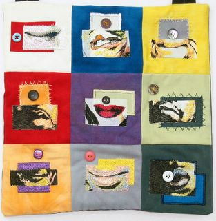
My local guild is sponsoring a collaborative effort involving idioms. we each have to come up with a 12 inch quilt depicting an idiom. I chose 'button your lips'. I worked on it last weekend, and presented it at the meeting Monday. There were a total of 30 'idiom' quilts at the meeting. What a sight! Posted by Picasa